

Table of contents
Learn how to make responsive screens with Flutter.
If you are a Mobile Developer then you must know the importance of making responsive screens for sure. Also, it's a challenge for all of us developers to make screens responsive. Now the question is why we should make responsive Ui?
So let me explain.🤓
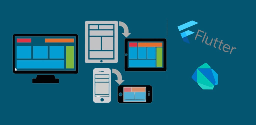
Nowadays there exists a variety of devices with different variety of screen sizes. Like mobile devices, tablets, smart TVs, smart watches, foldable, desktops etc. Now with flutter, we aim to code for a single UI which should support all the respective screen sizes where the application will run and also the UI should look cool which will make a smooth user experience😎.
And here comes the challenges for us developers😖. But don't worry after reading this blog you will get the idea of making responsive screens while screen orientation changes. And thus you will able to manage your UI for different screen sizes according to your need.
So Hey developers, Let's Get Started...🏃🏃🏃
Our Aim:-
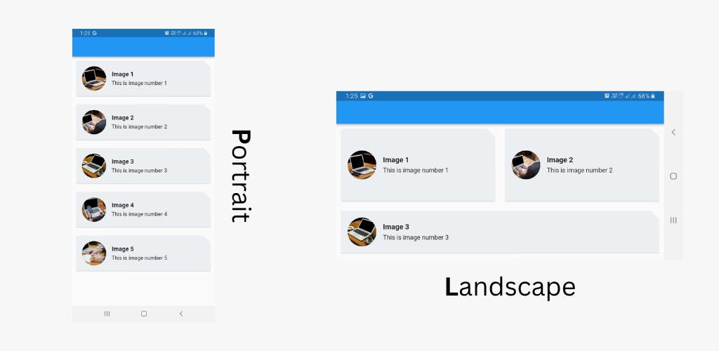
We will create a simple screen with 5 items like given below for portrait mode and will slightly change the UI orientations of the first two items for landscape mode. And of course, the functionality of each item should remain the same.
Let's Begin:-
First, let's create a widget for each item in the list.
Widget getListItem(int pos,BuildContext context){
  return Padding(
    padding: const EdgeInsets.all(8.0),
    child: Card(
      color: const Color(0xffeceff1),
      shape: const BeveledRectangleBorder(
        borderRadius: BorderRadius.only(
            topRight: Radius.circular(20.0)
        )
      ),
        child: Row(
          children: [Expanded(
            child: InkWell(
              onTap: () {

              },
              child: Padding(
                padding: const EdgeInsets.all(16.0),
                child: Row(
                  children:[
                    ClipRRect(
                      borderRadius: BorderRadius.circular(40.0),
                      child: Image.network(
                        "https://picsum.photos/id/$pos/200",
                        height: 70.0,
                        width: 70.0,
                      ),
                    ),
                    const SizedBox(
                      width: 16
                    ),
                    Column(
                      mainAxisAlignment: MainAxisAlignment.center,
                      crossAxisAlignment: CrossAxisAlignment.start,
                      children: [
                        Text(
                            "Image ${pos+1}",
                          style: const TextStyle(
                            fontWeight: FontWeight.bold,
                            fontSize: 16
                          ),
                        ),
                        const SizedBox(
                            height: 6,
                        ),
                        Text(
                          "This is image number ${pos+1}",
                        )
                      ],
                    )
                  ],
                ),
              ),
            ),
          )],
        ),
    ),
  );
}
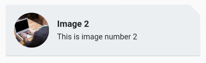
here the function named getListItem() is returning a widget (the list item widget) and takes a pos (position of the Item) and a BuildContext as parameters. This snippet of code is responsible for making UI like this,
I am not diving deep into the above code. Also, you can customize it as you wish. My main aim is to explain how the screen UI changes for orientation change.
So now let's see how the screen orientation change impacted the code.
class MainScreenPage extends StatefulWidget {

  @override
  _MainScreenPageState createState() => _MainScreenPageState();
}

class _MainScreenPageState extends State<MainScreenPage> {
  var isLargeScreen = false;

  @override
  Widget build(BuildContext context) {
    return Scaffold(
      appBar: AppBar(),
      body: OrientationBuilder(builder: (context, orientation) {

        if (MediaQuery.of(context).size.width > 600) {
          isLargeScreen = true;
        } else {
          isLargeScreen = false;
        }

        return SingleChildScrollView(
          child: Container(
            child: Column(children: <Widget>[
              isLargeScreen ? Row(
                children: [
                  Expanded(
                      child: Container(
                          height: 200,
                          child: getListItem(0,context))
                  ),
                  Expanded(
                      child: Container(
                        height: 200,
                          child: getListItem(1,context))
                  ),
                ],
              ) : Column(
                children: [
                  getListItem(0,context),
                  getListItem(1,context),
                ],
              ),
              getListItem(2,context),
              getListItem(3,context),
              getListItem(4,context),
            ]),
          ),
        );
      }),
    );
  }
}
Now let's understand what is happening here.
Here you can see the stateful widget named as MainScreenPage() which is responsible for handling the orientation change. Inside the Scaffold() widgets body you can see the whole body widget is wrapped with OrientationBuilder() which checks the screen orientation in real-time (at the time of rendering the UI).
body: OrientationBuilder(builder: (context, orientation) {
 return Widget;
});
Here the OrientationBuilder is giving a current BuildContext (context) and current screen orientation (either Portrait or Landscape). Now Inside OrientationBuilder, we are checking if the current screen size is > 600 and then marking it as a large screen with isLargeScreen variable. To do so we are using,
if (MediaQuery.of(context).size.width > 600) {
  isLargeScreen = true;
} else {
  isLargeScreen = false;
}
Here MediaQuery.of(context).size.width is returning the current screen width.
Now if the screen is large (means isLargeScreen = true) then we are wrapping first two list items inside a Row() widget else wrap them with a Column() widget.
isLargeScreen ? Row(
  children: [
    Expanded(
        child: Container(
            height: 200,
            child: getListItem(0,context))
    ),
    Expanded(
        child: Container(
          height: 200,
            child: getListItem(1,context))
    ),
  ],
) : Column(
  children: [
    getListItem(0,context),
    getListItem(1,context),
  ],
)
Here see carefully when the screen is large (in our example when the screen is in landscape mode) then we wrapped the 1st and 2nd list item's Containers with the Expanded() widget which is giving the responsiveness according to our need.
So yeah!! Here we go. Hope you have enjoyed. Thank you.